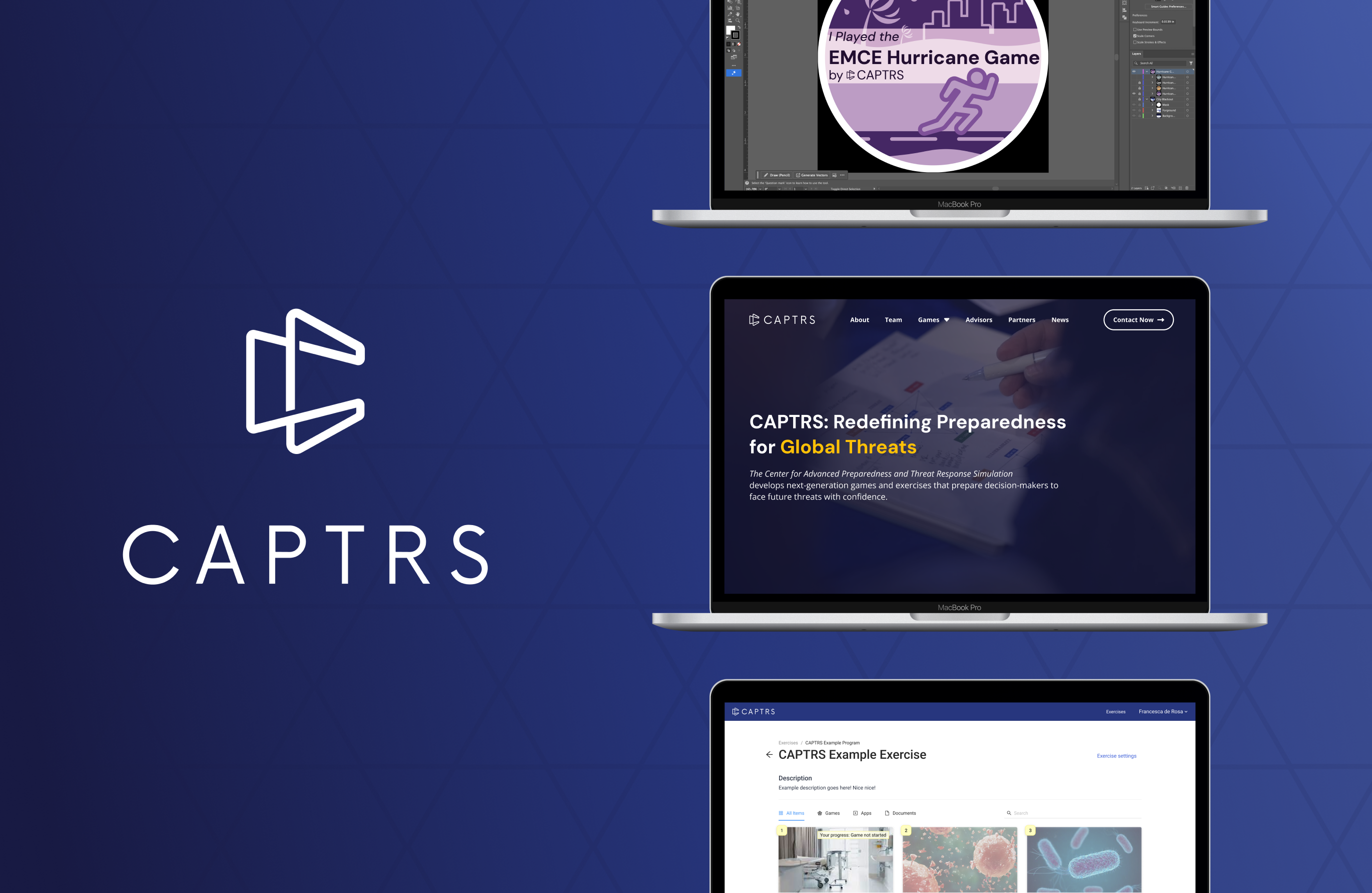
CAPTRS

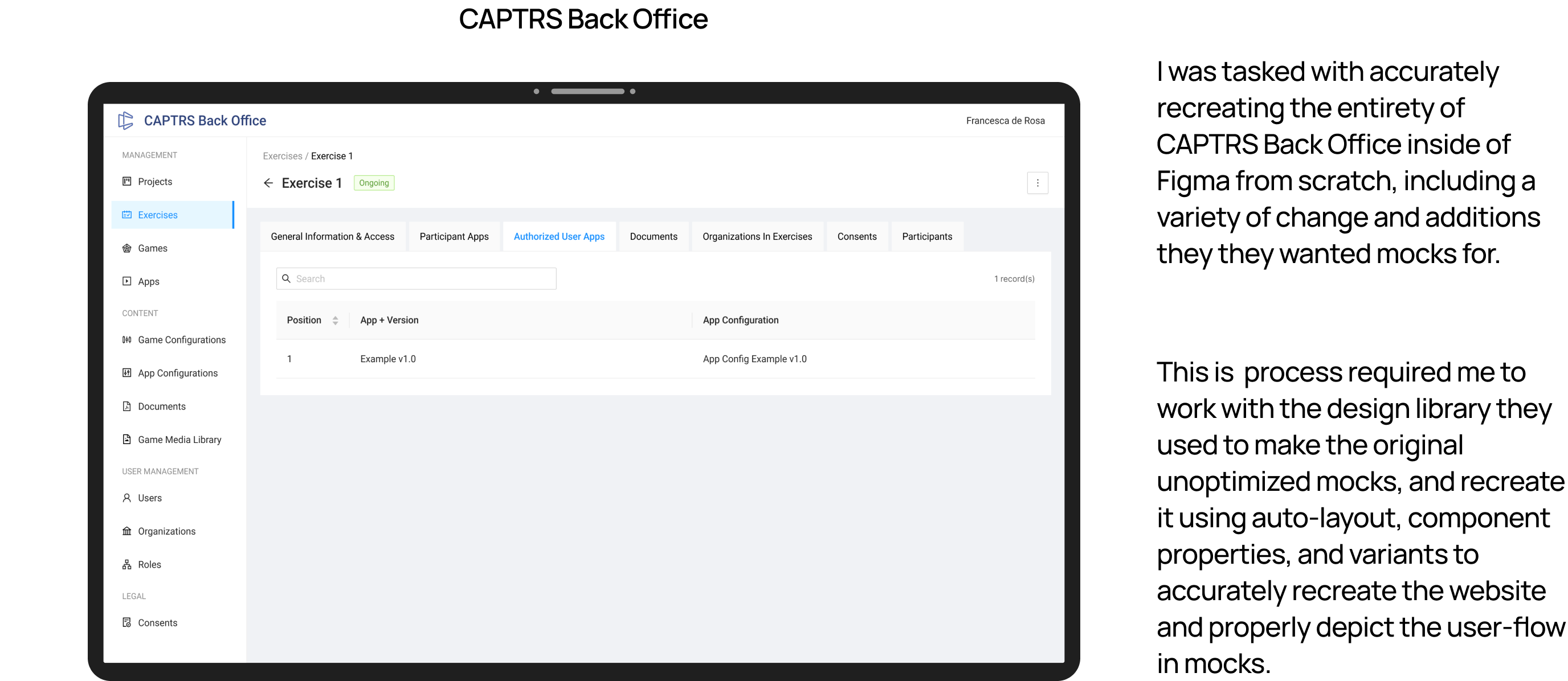
Part-time UX Designer for CAPTRS. Partnered with domestic and global team members for serious game projects. Responsibilities include researching, analyzing, and creating mocks for their various websites, applications, and game platforms.
Project
Part-time UX Designer
role(s)
UX Designer
 / 
User Researcher
 / 
Graphic Designer
Client
CAPTRS
Timeline
May 2025 - Present
Play Now on itch.io
Project Overview

After graduating college in May 2025, I joined CAPTRS, a non-profit wargaming company, as a part-time UX Designer. CAPTRS creates game-based simulations to help organizations explore real-world challenges, from crisis response to strategic planning.

I was brought on to support their growing mix of digital and analog projects, helping refine how their brand, visuals, and user experience came together across mediums.

ROLE

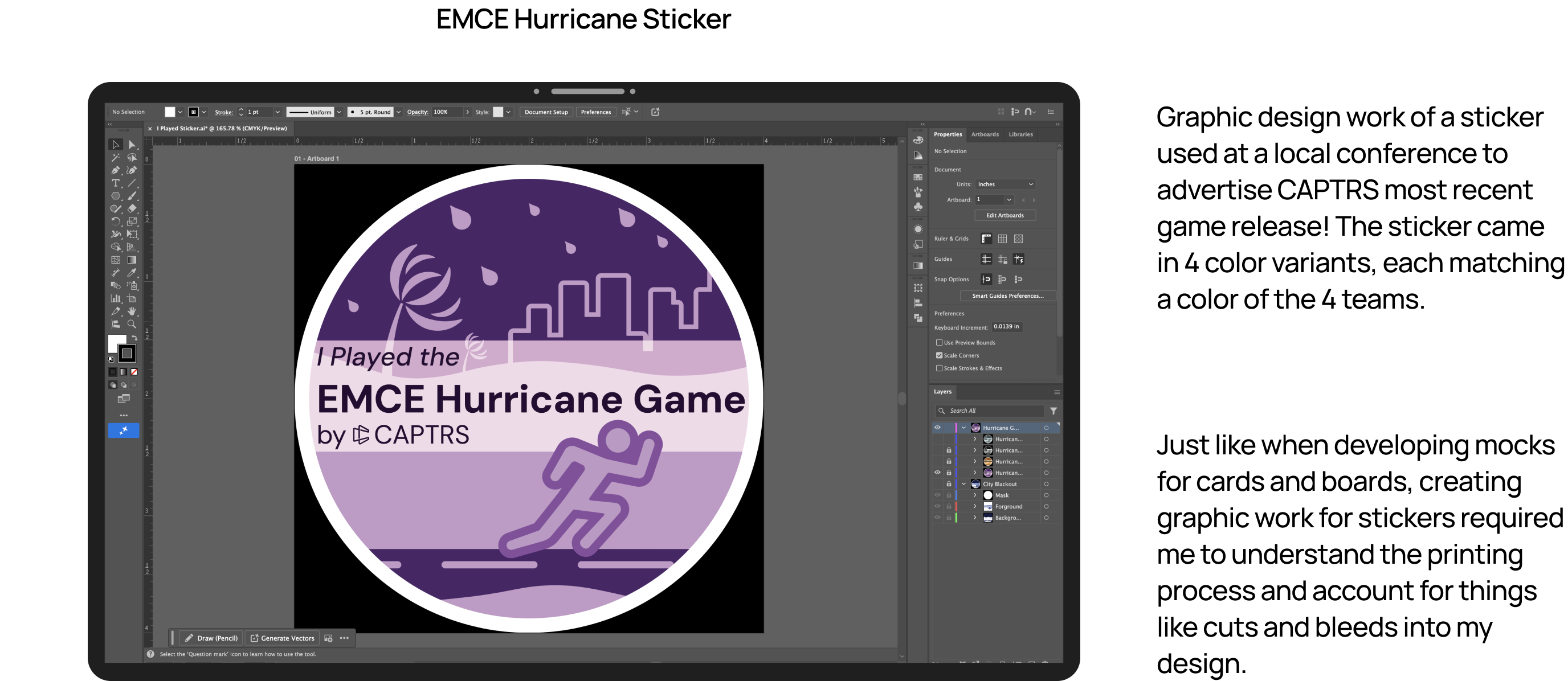
At CAPTRS, I’ve worn a lot of creative hats. My work has ranged from web design and UI systems to board game layouts, graphics, slide decks, and promotional materials. No two projects were the same, but they all shared one goal: to make CAPTRS’s mission look and feel cohesive.

Using tools like Figma, Photoshop, and Illustrator, I helped translate the team’s ideas into polished designs that balanced functionality and personality. Collaborating with a fully remote global team also meant practicing clear communication, documentation, and time management to keep projects aligned and on schedule.

Problem statement

When I joined CAPTRS, most of the organization’s design work was handled by a single designer who managed everything from digital interfaces to printed materials. As the volume of projects grew, I noticed she often had to manually recreate the same components and layouts across different files.

This process worked in the short term but was time-consuming and inconsistent in the long run. There was no shared design system or reusable component library to keep projects aligned. I saw an opportunity to make that workflow more efficient by creating a scalable Figma component library and an expanded design style guide that could serve as the foundation for all future design work at CAPTRS.

GOAL

My main goal was to bring consistency, structure, and scalability to CAPTRS’s design process. As a small, non-profit organization, they did not have anyone on staff that was solely dedicated to user-centered design. It was an opportunity to help shape and build a UX identity at the organization.

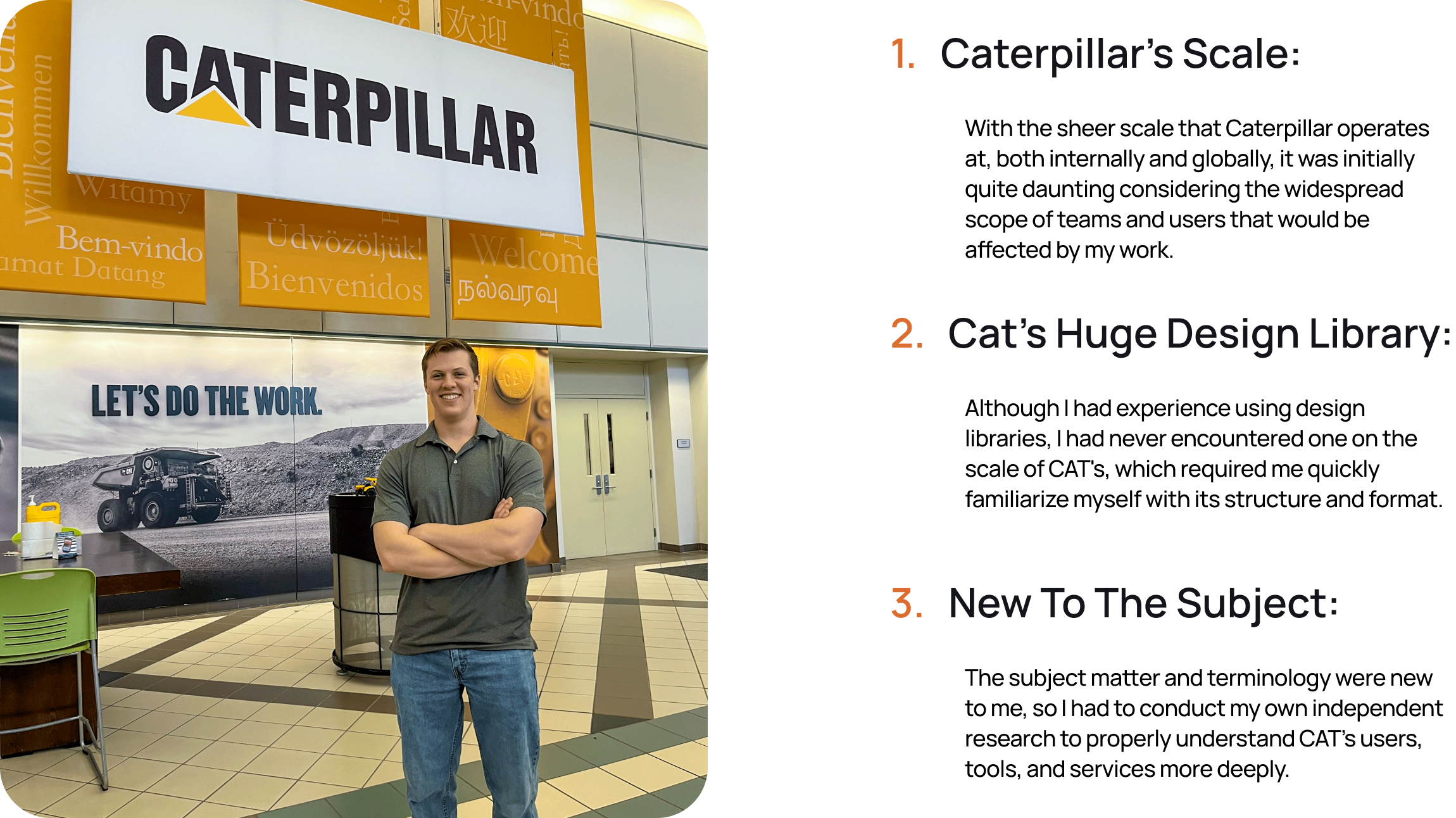
A personal goal was to apply what I learned at Caterpillar, Inc. into the newly developed UX department at CAPTRS. A big part of this was applying what I learned from working in large corporate design environments, like Caterpillar, to a smaller, mission-driven organization. I wanted to help CAPTRS operate with the same design discipline and long-term vision while keeping the creativity and agility that define their work.

Target Audience

CAPTRS’s work sits at the crossroads of strategy, education, and play. Their audience includes professionals in policy, defense, academia, and crisis management who use wargaming as a tool for training and research.

Designing for this audience meant finding a balance between credibility and creativity—something engaging enough to reflect CAPTRS’s game-based roots, but structured enough to resonate with subject-matter experts and decision-makers.

DESIGN PROCESS

Working with a small, fully remote team meant I often had to wear many hats and manage projects from start to finish. Most initiatives were self-directed, requiring me to handle every stage of the process, from research and ideation to design, iteration, and delivery.

Because of our global setup, clear communication was critical. I made a point to keep the team updated on project status, design decisions, and roadblocks, ensuring transparency even across time zones.

Whenever I began a new task, my first step was research. I didn’t just look for visual inspiration; I dug into the project’s goals, audience, and intended use to understand why it mattered and how design could best support it. This helped me connect each deliverable back to CAPTRS’s larger mission and ensure that every design choice served a purpose.

From there, I moved into iteration and prototyping.  In order to standardize designs, I developed a unified brand system that could flex across digital and print contexts. I developed a living component library in Figma, giving the team reusable, adaptable design elements for faster collaboration. Alongside that, I supported several website initiatives, expanding layouts, refining color palettes, and experimenting with new design principles that reflected CAPTRS’s evolving identity.

I started with quick sketches and early wireframes to explore different ideas, then developed high-fidelity mocks in Figma using the component library I had built. By leveraging this system, I could work faster, maintain visual consistency, and adapt designs efficiently across projects.
This process not only streamlined my own workflow but also made it easier for others in the future to reuse and expand on my work, laying the groundwork for a more scalable and collaborative design ecosystem at CAPTRS.

Early Design

Because CAPTRS’s work blends strategy, education, and gameplay, my early design explorations focused on finding a balance between clarity and engagement. I experimented with layouts that could present complex information in a way that still felt interactive and approachable.

During this phase, I created quick sketches and low-fidelity wireframes to test different ways of organizing content and hierarchy. These explorations helped me translate CAPTRS’s analytical, game-inspired mindset into a visual direction that felt both structured and dynamic.

Iteration

With a clear direction in place, I began refining layouts and visual structure through a few focused rounds of iteration. I shared progress with the team for quick feedback and used those insights to adjust hierarchy, spacing, and overall flow.

This stage was about fine-tuning ideas before moving into high-fidelity design, ensuring the foundation felt cohesive and ready for polish.

Concept vs final
High Fidelity Mockups

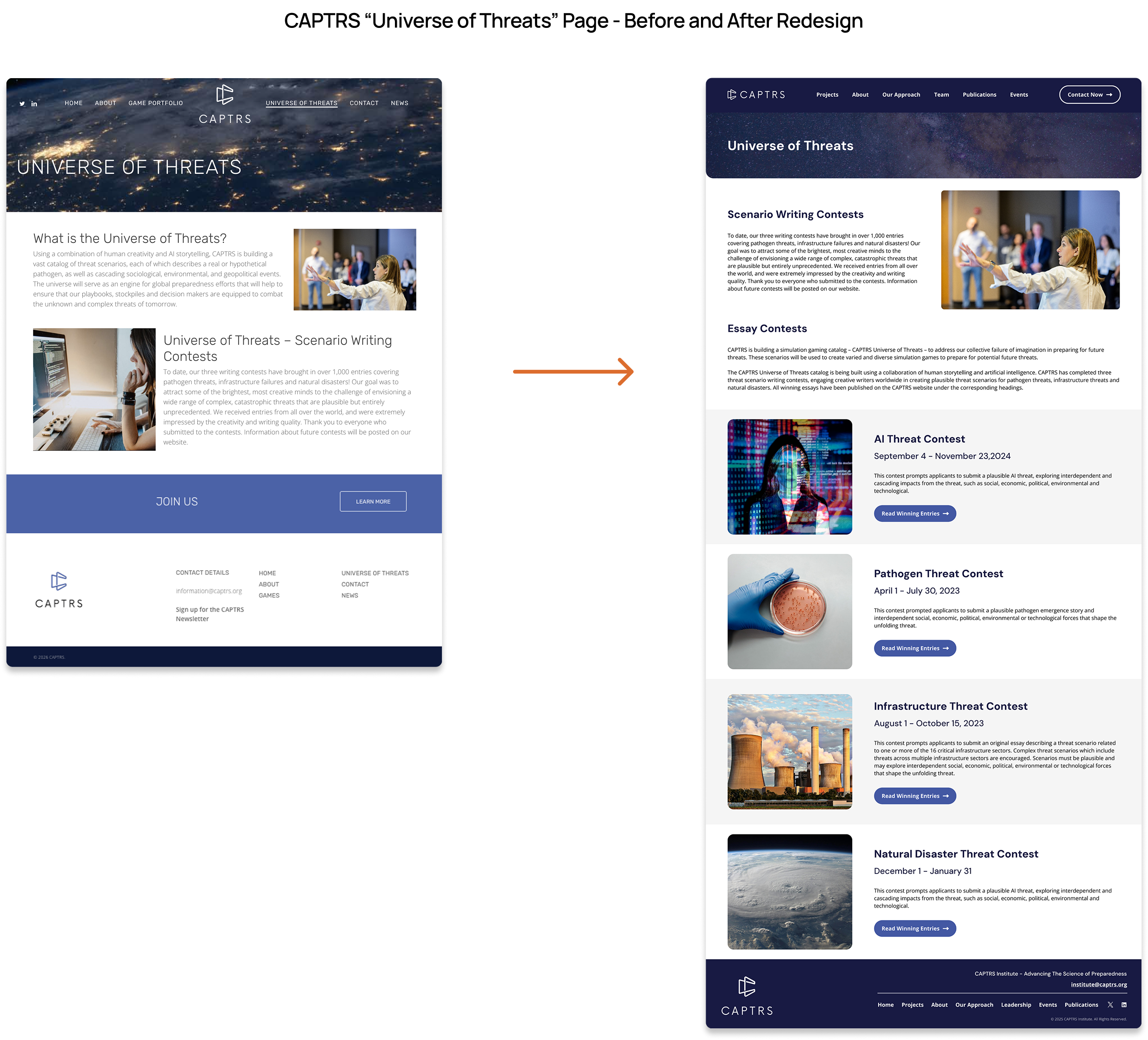
After multiple iterations, I moved into high-fidelity design, using the Figma component library I had built to ensure consistency across pages and future projects. This systemized approach let me work quickly while maintaining visual quality and scalability.
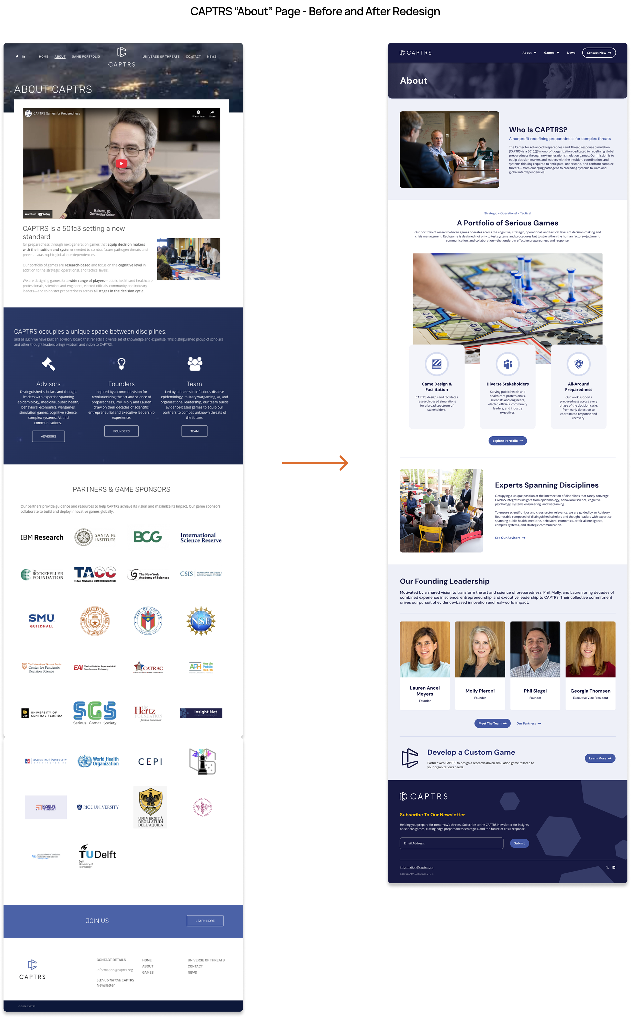
The high-fidelity phase focused on aligning CAPTRS’s brand identity with a more modern and professional digital presence. I refined details like iconography, navigation structure, and responsive behavior to make the site both functional and visually engaging.

Each final design aimed to reflect what makes CAPTRS unique, a balance between credibility and creativity, between the analytical world of wargaming and the imaginative, human side of design. The result was a set of designs that not only met the organization’s practical goals but also strengthened its visual identity for future growth.

IMPACT

I feel that my work at CAPTRS has been an extreamly fruitful one. By introducing a reusable Figma component library, I streamlined the design process and reduced repetitive work across projects. What once took hours to rebuild can now be done in minutes.
I also expanded the company’s visual language, creating a more flexible and cohesive style that works across both digital and analog materials. This consistency has strengthened CAPTRS’s brand identity and made collaboration between designers and non-designers much smoother.

Beyond the tangible systems, my work helped shape how design fits into CAPTRS’s culture, treating it as a strategic tool for communication, organization, and storytelling.

key Takeaways

My experience at CAPTRS has been both exciting and transformative. Working across such a wide range of projects, from web design to board games, has strengthened my design versatility and pushed me to adapt quickly to new challenges.

This role marked my first opportunity to take what I learned in school and internships and apply it in a professional setting. It taught me how to own a design project from start to finish, communicate clearly in a fully remote team, and balance creativity with structure.

Beyond growing my technical and organizational skills, this experience deepened my appreciation for systems thinking. Building CAPTRS’s component library and expanding its brand style showed me how thoughtful design systems can empower creativity, improve collaboration, and elevate the impact of an entire organization.

CAPTRS

Part-time UX Designer for CAPTRS. Partnered with domestic and global team members for serious game projects. Responsibilities include researching, analyzing, and creating mocks for their various websites, applications, and game platforms.
Project
Part-time UX Designer
role(s)
UX Designer
 / 
User Researcher
 / 
Graphic Designer
Client
CAPTRS
Timeline
May 2025 - Present
Check It My Figma
Project Overview

After graduating college in May 2025, I joined CAPTRS, a non-profit wargaming company, as a part-time UX Designer. CAPTRS creates game-based simulations to help organizations explore real-world challenges, from crisis response to strategic planning.

I was brought on to support their growing mix of digital and analog projects, helping refine how their brand, visuals, and user experience came together across mediums.

ROLE

At CAPTRS, I’ve worn a lot of creative hats. My work has ranged from web design and UI systems to board game layouts, graphics, slide decks, and promotional materials. No two projects were the same, but they all shared one goal: to make CAPTRS’s mission look and feel cohesive.

Using tools like Figma, Photoshop, and Illustrator, I helped translate the team’s ideas into polished designs that balanced functionality and personality. Collaborating with a fully remote global team also meant practicing clear communication, documentation, and time management to keep projects aligned and on schedule.

Problem statement

When I joined CAPTRS, most of the organization’s design work was handled by a single designer who managed everything from digital interfaces to printed materials. As the volume of projects grew, I noticed she often had to manually recreate the same components and layouts across different files.

This process worked in the short term but was time-consuming and inconsistent in the long run. There was no shared design system or reusable component library to keep projects aligned. I saw an opportunity to make that workflow more efficient by creating a scalable Figma component library and an expanded design style guide that could serve as the foundation for all future design work at CAPTRS.

GOAL

My main goal was to bring consistency, structure, and scalability to CAPTRS’s design process. As a small, non-profit organization, they did not have anyone on staff that was solely dedicated to user-centered design. It was an opportunity to help shape and build a UX identity at the organization.

A personal goal was to apply what I learned at Caterpillar, Inc. into the newly developed UX department at CAPTRS. A big part of this was applying what I learned from working in large corporate design environments, like Caterpillar, to a smaller, mission-driven organization. I wanted to help CAPTRS operate with the same design discipline and long-term vision while keeping the creativity and agility that define their work.

Target Audience

CAPTRS’s work sits at the crossroads of strategy, education, and play. Their audience includes professionals in policy, defense, academia, and crisis management who use wargaming as a tool for training and research.

Designing for this audience meant finding a balance between credibility and creativity—something engaging enough to reflect CAPTRS’s game-based roots, but structured enough to resonate with subject-matter experts and decision-makers.

DESIGN PROCESS

Working with a small, fully remote team meant I often had to wear many hats and manage projects from start to finish. Most initiatives were self-directed, requiring me to handle every stage of the process, from research and ideation to design, iteration, and delivery.

Because of our global setup, clear communication was critical. I made a point to keep the team updated on project status, design decisions, and roadblocks, ensuring transparency even across time zones.

Whenever I began a new task, my first step was research. I didn’t just look for visual inspiration; I dug into the project’s goals, audience, and intended use to understand why it mattered and how design could best support it. This helped me connect each deliverable back to CAPTRS’s larger mission and ensure that every design choice served a purpose.

From there, I moved into iteration and prototyping.  In order to standardize designs, I developed a unified brand system that could flex across digital and print contexts. I developed a living component library in Figma, giving the team reusable, adaptable design elements for faster collaboration. Alongside that, I supported several website initiatives, expanding layouts, refining color palettes, and experimenting with new design principles that reflected CAPTRS’s evolving identity.

I started with quick sketches and early wireframes to explore different ideas, then developed high-fidelity mocks in Figma using the component library I had built. By leveraging this system, I could work faster, maintain visual consistency, and adapt designs efficiently across projects.

This process not only streamlined my own workflow but also made it easier for others in the future to reuse and expand on my work, laying the groundwork for a more scalable and collaborative design ecosystem at CAPTRS.

User Research

User research has been a key part of my work at CAPTRS, especially within our website projects, where I’ve often served as the sole designer leading the process from exploration to design.

When I joined, my experience designing full websites was limited to my personal portfolio. Knowing I’d be responsible for multiple high-impact site redesigns, I began by conducting extensive research, not only into the websites themselves but also into modern design patterns, usability principles, and site architecture best practices.

For each project, my research started with a deep audit of the existing site: analyzing structure, content, and analytics to identify what worked, what didn’t, and where users dropped off. For example, on the CAPTRS main site redesign, I began by mapping the current information hierarchy and evaluating engagement metrics to uncover friction points.

From there, I conducted user interviews with my coworkers and internal stakeholders to understand their experiences. I asked what they liked about the site, what frustrated them, and what new features they hoped to see. This helped me avoid designing from personal preference and instead ground the redesign in real feedback from the people who used and maintained the site most.

All of these insights were compiled into a clear, organized document that guided my design decisions moving forward. This research-first approach allowed me to design with purpose, ensuring that every layout, navigation change, and content adjustment addressed a real need rather than an assumption.

Early Design

Because CAPTRS’s work blends strategy, education, and gameplay, my early design explorations focused on finding a balance between clarity and engagement. I experimented with layouts that could present complex information in a way that still felt interactive and approachable.

During this phase, I created quick sketches and low-fidelity wireframes to test different ways of organizing content and hierarchy. These explorations helped me translate CAPTRS’s analytical, game-inspired mindset into a visual direction that felt both structured and dynamic.

Iteration

With a clear direction in place, I began refining layouts and visual structure through a few focused rounds of iteration. I shared progress with the team for quick feedback and used those insights to adjust hierarchy, spacing, and overall flow.

This stage was about fine-tuning ideas before moving into high-fidelity design, ensuring the foundation felt cohesive and ready for polish.

Concept vs final
High Fidelity Mockups

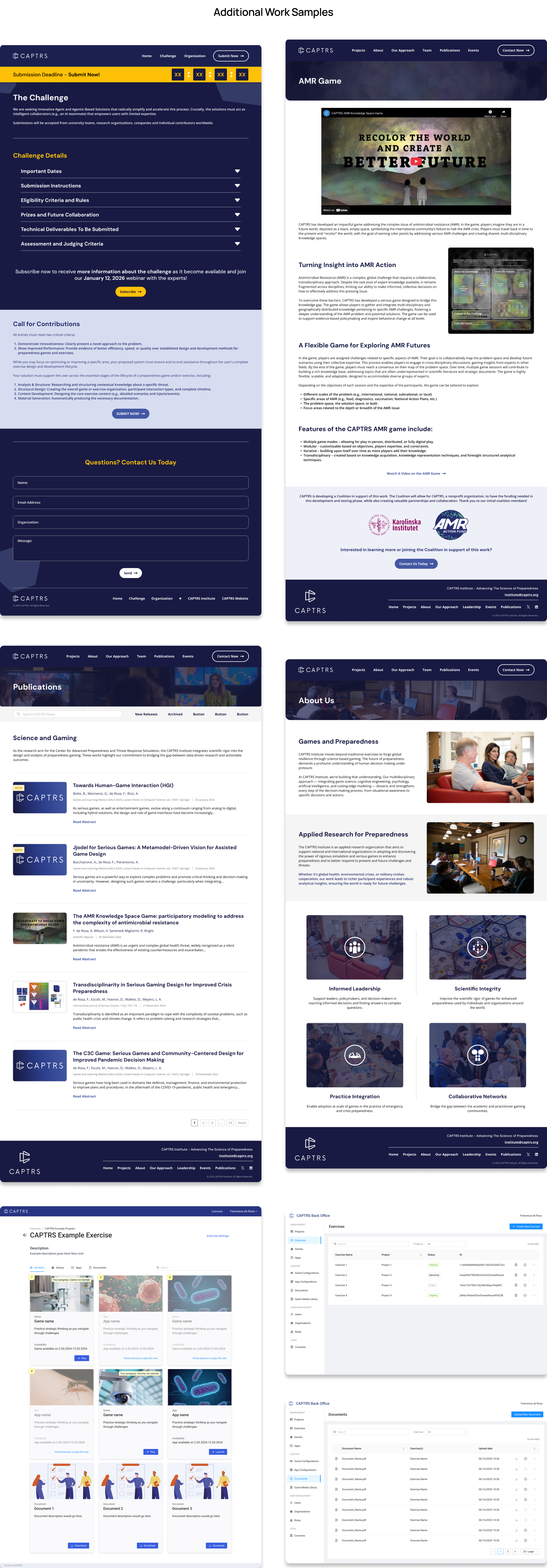
After multiple iterations, I moved into high-fidelity design, using the Figma component library I had built to ensure consistency across pages and future projects. This systemized approach let me work quickly while maintaining visual quality and scalability.
The high-fidelity phase focused on aligning CAPTRS’s brand identity with a more modern and professional digital presence. I refined details like iconography, navigation structure, and responsive behavior to make the site both functional and visually engaging.

Each final design aimed to reflect what makes CAPTRS unique, a balance between credibility and creativity, between the analytical world of wargaming and the imaginative, human side of design. The result was a set of designs that not only met the organization’s practical goals but also strengthened its visual identity for future growth.

IMPACT

I feel that my work at CAPTRS has been an extreamly fruitful one. By introducing a reusable Figma component library, I streamlined the design process and reduced repetitive work across projects. What once took hours to rebuild can now be done in minutes.
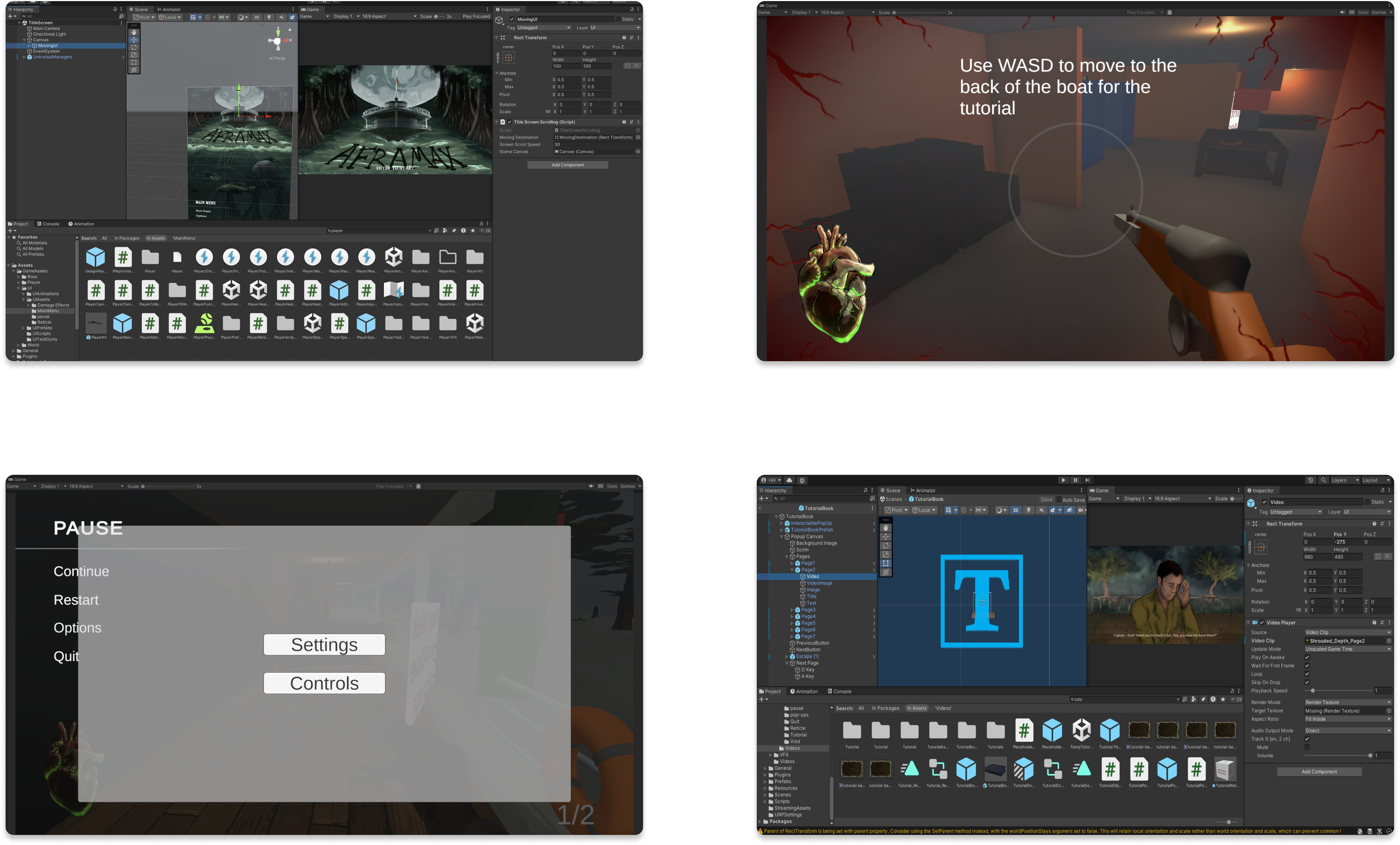
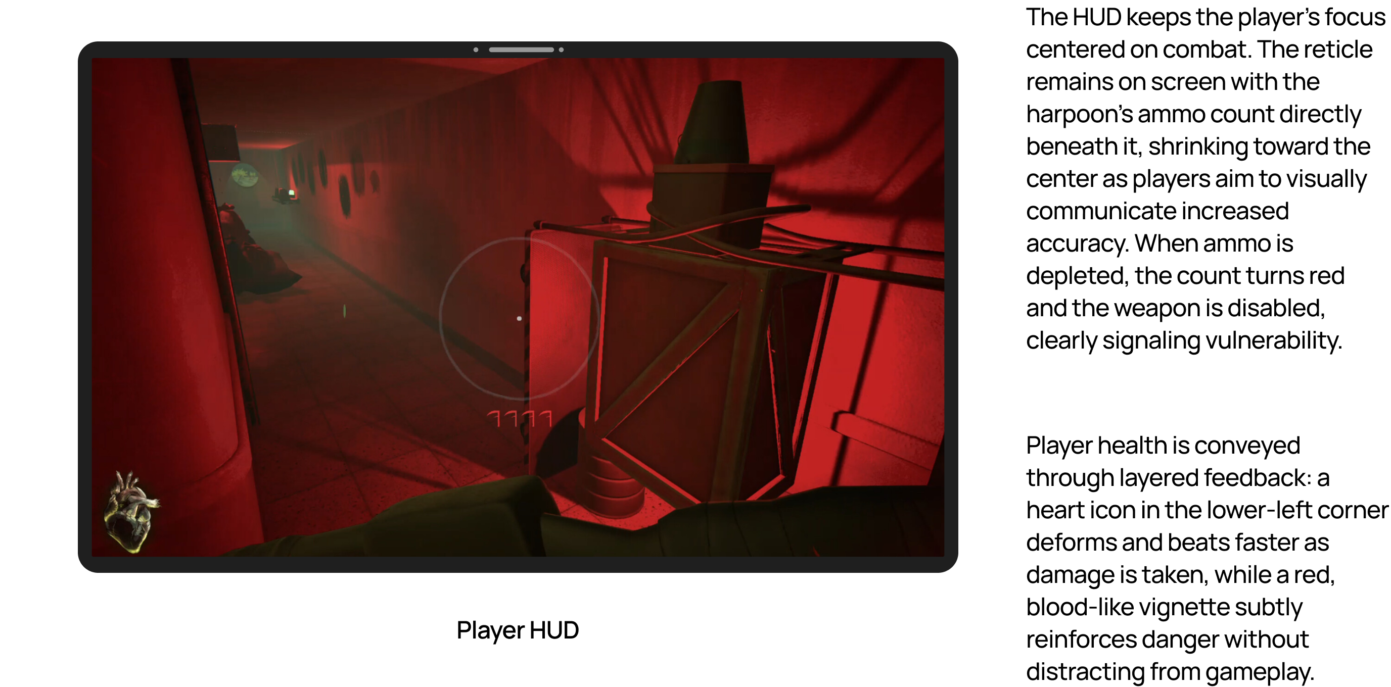
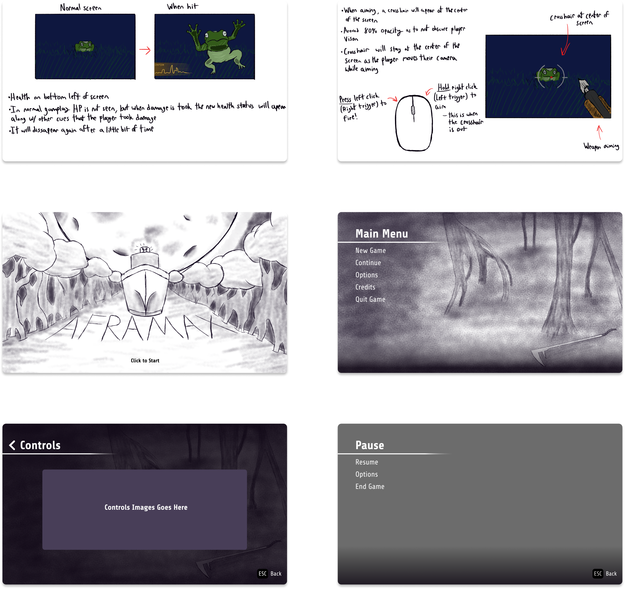
I also expanded the company’s visual language, creating a more flexible and cohesive style that works across both digital and analog materials. This consistency has strengthened CAPTRS’s brand identity and made collaboration between designers and non-designers much smoother.
Beyond the tangible systems, my work helped shape how design fits into CAPTRS’s culture, treating it as a strategic tool for communication, organization, and storytelling.

key Takeaways

My experience at CAPTRS has been both exciting and transformative. Working across such a wide range of projects, from web design to board games, has strengthened my design versatility and pushed me to adapt quickly to new challenges.

This role marked my first opportunity to take what I learned in school and internships and apply it in a professional setting. It taught me how to own a design project from start to finish, communicate clearly in a fully remote team, and balance creativity with structure.

Beyond growing my technical and organizational skills, this experience deepened my appreciation for systems thinking. Building CAPTRS’s component library and expanding its brand style showed me how thoughtful design systems can empower creativity, improve collaboration, and elevate the impact of an entire organization.

CAPTRS

Part-time UX Designer for CAPTRS. Partnered with domestic and global team members for serious game projects. Responsibilities include researching, analyzing, and creating mocks for their various websites, applications, and game platforms.
Project
Part-time UX Designer
role(s)
UX Designer
 / 
User Researcher
 / 
Graphic Designer
Client
CAPTRS
Timeline
May 2025 - Present
Play On Steam
Project Overview

After graduating college in May 2025, I joined CAPTRS, a non-profit wargaming company, as a part-time UX Designer. CAPTRS creates game-based simulations to help organizations explore real-world challenges, from crisis response to strategic planning.

I was brought on to support their growing mix of digital and analog projects, helping refine how their brand, visuals, and user experience came together across mediums.

ROLE

At CAPTRS, I’ve worn a lot of creative hats. My work has ranged from web design and UI systems to board game layouts, graphics, slide decks, and promotional materials. No two projects were the same, but they all shared one goal: to make CAPTRS’s mission look and feel cohesive.

Using tools like Figma, Photoshop, and Illustrator, I helped translate the team’s ideas into polished designs that balanced functionality and personality. Collaborating with a fully remote global team also meant practicing clear communication, documentation, and time management to keep projects aligned and on schedule.

Problem statement

When I joined CAPTRS, most of the organization’s design work was handled by a single designer who managed everything from digital interfaces to printed materials. As the volume of projects grew, I noticed she often had to manually recreate the same components and layouts across different files.

This process worked in the short term but was time-consuming and inconsistent in the long run. There was no shared design system or reusable component library to keep projects aligned. I saw an opportunity to make that workflow more efficient by creating a scalable Figma component library and an expanded design style guide that could serve as the foundation for all future design work at CAPTRS.

GOAL

My main goal was to bring consistency, structure, and scalability to CAPTRS’s design process. As a small, non-profit organization, they did not have anyone on staff that was solely dedicated to user-centered design. It was an opportunity to help shape and build a UX identity at the organization.

A personal goal was to apply what I learned at Caterpillar, Inc. into the newly developed UX department at CAPTRS. A big part of this was applying what I learned from working in large corporate design environments, like Caterpillar, to a smaller, mission-driven organization. I wanted to help CAPTRS operate with the same design discipline and long-term vision while keeping the creativity and agility that define their work.

Target Audience

CAPTRS’s work sits at the crossroads of strategy, education, and play. Their audience includes professionals in policy, defense, academia, and crisis management who use wargaming as a tool for training and research.

Designing for this audience meant finding a balance between credibility and creativity—something engaging enough to reflect CAPTRS’s game-based roots, but structured enough to resonate with subject-matter experts and decision-makers.

DESIGN PROCESS

Working with a small, fully remote team meant I often had to wear many hats and manage projects from start to finish. Most initiatives were self-directed, requiring me to handle every stage of the process, from research and ideation to design, iteration, and delivery.

Because of our global setup, clear communication was critical. I made a point to keep the team updated on project status, design decisions, and roadblocks, ensuring transparency even across time zones.

Whenever I began a new task, my first step was research. I didn’t just look for visual inspiration; I dug into the project’s goals, audience, and intended use to understand why it mattered and how design could best support it. This helped me connect each deliverable back to CAPTRS’s larger mission and ensure that every design choice served a purpose.

From there, I moved into iteration and prototyping.  In order to standardize designs, I developed a unified brand system that could flex across digital and print contexts. I developed a living component library in Figma, giving the team reusable, adaptable design elements for faster collaboration. Alongside that, I supported several website initiatives, expanding layouts, refining color palettes, and experimenting with new design principles that reflected CAPTRS’s evolving identity.

I started with quick sketches and early wireframes to explore different ideas, then developed high-fidelity mocks in Figma using the component library I had built. By leveraging this system, I could work faster, maintain visual consistency, and adapt designs efficiently across projects.

This process not only streamlined my own workflow but also made it easier for others in the future to reuse and expand on my work, laying the groundwork for a more scalable and collaborative design ecosystem at CAPTRS.

Early Design

Because CAPTRS’s work blends strategy, education, and gameplay, my early design explorations focused on finding a balance between clarity and engagement. I experimented with layouts that could present complex information in a way that still felt interactive and approachable.

During this phase, I created quick sketches and low-fidelity wireframes to test different ways of organizing content and hierarchy. These explorations helped me translate CAPTRS’s analytical, game-inspired mindset into a visual direction that felt both structured and dynamic.

Iteration

With a clear direction in place, I began refining layouts and visual structure through a few focused rounds of iteration. I shared progress with the team for quick feedback and used those insights to adjust hierarchy, spacing, and overall flow.

This stage was about fine-tuning ideas before moving into high-fidelity design, ensuring the foundation felt cohesive and ready for polish.

Concept vs final
High Fidelity Mockups

After multiple iterations, I moved into high-fidelity design, using the Figma component library I had built to ensure consistency across pages and future projects. This systemized approach let me work quickly while maintaining visual quality and scalability.

The high-fidelity phase focused on aligning CAPTRS’s brand identity with a more modern and professional digital presence. I refined details like iconography, navigation structure, and responsive behavior to make the site both functional and visually engaging.

Each final design aimed to reflect what makes CAPTRS unique, a balance between credibility and creativity, between the analytical world of wargaming and the imaginative, human side of design. The result was a set of designs that not only met the organization’s practical goals but also strengthened its visual identity for future growth.

IMPACT

I feel that my work at CAPTRS has been an extreamly fruitful one. By introducing a reusable Figma component library, I streamlined the design process and reduced repetitive work across projects. What once took hours to rebuild can now be done in minutes.

I also expanded the company’s visual language, creating a more flexible and cohesive style that works across both digital and analog materials. This consistency has strengthened CAPTRS’s brand identity and made collaboration between designers and non-designers much smoother.

Beyond the tangible systems, my work helped shape how design fits into CAPTRS’s culture, treating it as a strategic tool for communication, organization, and storytelling.

key Takeaways

My experience at CAPTRS has been both exciting and transformative. Working across such a wide range of projects, from web design to board games, has strengthened my design versatility and pushed me to adapt quickly to new challenges.

This role marked my first opportunity to take what I learned in school and internships and apply it in a professional setting. It taught me how to own a design project from start to finish, communicate clearly in a fully remote team, and balance creativity with structure.

Beyond growing my technical and organizational skills, this experience deepened my appreciation for systems thinking. Building CAPTRS’s component library and expanding its brand style showed me how thoughtful design systems can empower creativity, improve collaboration, and elevate the impact of an entire organization.

CAPTRS

Part-time UX Designer for CAPTRS. Partnered with domestic and global team members for serious game projects. Responsibilities include researching, analyzing, and creating mocks for their various websites, applications, and game platforms.
Project
Part-time UX Designer
role(s)
UX Designer
 / 
User Researcher
 / 
Graphic Designer
Client
CAPTRS
Timeline
May 2025 - Present
Project Overview

After graduating college in May 2025, I joined CAPTRS, a non-profit wargaming company, as a part-time UX Designer. CAPTRS creates game-based simulations to help organizations explore real-world challenges, from crisis response to strategic planning.

I was brought on to support their growing mix of digital and analog projects, helping refine how their brand, visuals, and user experience came together across mediums.

ROLE

At CAPTRS, I’ve worn a lot of creative hats. My work has ranged from web design and UI systems to board game layouts, graphics, slide decks, and promotional materials. No two projects were the same, but they all shared one goal: to make CAPTRS’s mission look and feel cohesive.

Using tools like Figma, Photoshop, and Illustrator, I helped translate the team’s ideas into polished designs that balanced functionality and personality. Collaborating with a fully remote global team also meant practicing clear communication, documentation, and time management to keep projects aligned and on schedule.

Challenges

When I joined CAPTRS, most of the organization’s design work was handled by a single designer who managed everything from digital interfaces to printed materials. As the volume of projects grew, I noticed she often had to manually recreate the same components and layouts across different files.

This process worked in the short term but was time-consuming and inconsistent in the long run. There was no shared design system or reusable component library to keep projects aligned. I saw an opportunity to make that workflow more efficient by creating a scalable Figma component library and an expanded design style guide that could serve as the foundation for all future design work at CAPTRS.

Solutions

My main goal was to bring consistency, structure, and scalability to CAPTRS’s design process. As a small, non-profit organization, they did not have anyone on staff that was solely dedicated to user-centered design. It was an opportunity to help shape and build a UX identity at the organization.

A personal goal was to apply what I learned at Caterpillar, Inc. into the newly developed UX department at CAPTRS. A big part of this was applying what I learned from working in large corporate design environments, like Caterpillar, to a smaller, mission-driven organization. I wanted to help CAPTRS operate with the same design discipline and long-term vision while keeping the creativity and agility that define their work.

DESIGN PROCESS

Working with a small, fully remote team meant I often had to wear many hats and manage projects from start to finish. Most initiatives were self-directed, requiring me to handle every stage of the process, from research and ideation to design, iteration, and delivery.

Because of our global setup, clear communication was critical. I made a point to keep the team updated on project status, design decisions, and roadblocks, ensuring transparency even across time zones.

Whenever I began a new task, my first step was research. I didn’t just look for visual inspiration; I dug into the project’s goals, audience, and intended use to understand why it mattered and how design could best support it. This helped me connect each deliverable back to CAPTRS’s larger mission and ensure that every design choice served a purpose.

From there, I moved into iteration and prototyping.  In order to standardize designs, I developed a unified brand system that could flex across digital and print contexts. I developed a living component library in Figma, giving the team reusable, adaptable design elements for faster collaboration. Alongside that, I supported several website initiatives, expanding layouts, refining color palettes, and experimenting with new design principles that reflected CAPTRS’s evolving identity.

I started with quick sketches and early wireframes to explore different ideas, then developed high-fidelity mocks in Figma using the component library I had built. By leveraging this system, I could work faster, maintain visual consistency, and adapt designs efficiently across projects.

This process not only streamlined my own workflow but also made it easier for others in the future to reuse and expand on my work, laying the groundwork for a more scalable and collaborative design ecosystem at CAPTRS.

USER RESEARCH

User research has been a key part of my work at CAPTRS, especially within our website projects, where I’ve often served as the sole designer leading the process from exploration to design.

When I joined, my experience designing full websites was limited to my personal portfolio. Knowing I’d be responsible for multiple high-impact site redesigns, I began by conducting extensive research, not only into the websites themselves but also into modern design patterns, usability principles, and site architecture best practices.

For each project, my research started with a deep audit of the existing site: analyzing structure, content, and analytics to identify what worked, what didn’t, and where users dropped off. For example, on the CAPTRS main site redesign, I began by mapping the current information hierarchy and evaluating engagement metrics to uncover friction points.

From there, I conducted user interviews with my coworkers and internal stakeholders to understand their experiences. I asked what they liked about the site, what frustrated them, and what new features they hoped to see. This helped me avoid designing from personal preference and instead ground the redesign in real feedback from the people who used and maintained the site most.

All of these insights were compiled into a clear, organized document that guided my design decisions moving forward. This research-first approach allowed me to design with purpose, ensuring that every layout, navigation change, and content adjustment addressed a real need rather than an assumption.

Early Design

Because CAPTRS’s work blends strategy, education, and gameplay, my early design explorations focused on finding a balance between clarity and engagement. I experimented with layouts that could present complex information in a way that still felt interactive and approachable.

During this phase, I created quick sketches and low-fidelity wireframes to test different ways of organizing content and hierarchy. These explorations helped me translate CAPTRS’s analytical, game-inspired mindset into a visual direction that felt both structured and dynamic.

Iteration

With a clear direction in place, I began refining layouts and visual structure through a few focused rounds of iteration. I shared progress with the team for quick feedback and used those insights to adjust hierarchy, spacing, and overall flow.

This stage was about fine-tuning ideas before moving into high-fidelity design, ensuring the foundation felt cohesive and ready for polish.

High Fidelity Mockups

After multiple iterations, I moved into high-fidelity design, using the Figma component library I had built to ensure consistency across pages and future projects. This systemized approach let me work quickly while maintaining visual quality and scalability.

The high-fidelity phase focused on aligning CAPTRS’s brand identity with a more modern and professional digital presence. I refined details like iconography, navigation structure, and responsive behavior to make the site both functional and visually engaging.

Each final design aimed to reflect what makes CAPTRS unique, a balance between credibility and creativity, between the analytical world of wargaming and the imaginative, human side of design. The result was a set of designs that not only met the organization’s practical goals but also strengthened its visual identity for future growth.

IMPACT

I feel that my work at CAPTRS has been an extreamly fruitful one. By introducing a reusable Figma component library, I streamlined the design process and reduced repetitive work across projects. What once took hours to rebuild can now be done in minutes.

I also expanded the company’s visual language, creating a more flexible and cohesive style that works across both digital and analog materials. This consistency has strengthened CAPTRS’s brand identity and made collaboration between designers and non-designers much smoother.

Beyond the tangible systems, my work helped shape how design fits into CAPTRS’s culture, treating it as a strategic tool for communication, organization, and storytelling.

key Takeaways

My experience at CAPTRS has been both exciting and transformative. Working across such a wide range of projects, from web design to board games, has strengthened my design versatility and pushed me to adapt quickly to new challenges.

This role marked my first opportunity to take what I learned in school and internships and apply it in a professional setting. It taught me how to own a design project from start to finish, communicate clearly in a fully remote team, and balance creativity with structure.

Beyond growing my technical and organizational skills, this experience deepened my appreciation for systems thinking. Building CAPTRS’s component library and expanding its brand style showed me how thoughtful design systems can empower creativity, improve collaboration, and elevate the impact of an entire organization.